In response to high customer demand, our newest online service ‘Apply for a Design’ launched in September 2015. Customers have been quick to embrace the benefits of filing online with 69% of applications filed using this service in March 2016.
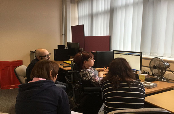
To ensure our services are accessible to all our customers, we wanted to see how both this service and our prototype performed when tested by customers who used a variety of assistive technologies. These included screen readers, voice activation tools, and the keyboard only method. So, the IPO’s User Research and UX teams visited DAC (Digital Accessibility Centre) in Neath to put it to the test.
DAC are a non-profit organisation that has over 30 years testing experience. They offer a wide range of services and work with their clients to create digital media that is accessible to everyone.
The team has a range of accessibility needs such as dyslexia, visual and mobility impairments. Each specialist talked us through their findings on a first-hand basis as they replicated their user journeys.
Here are some of the results…
Consistency is essential
We observed testers using JAWS (Job Access With Speech), a leading piece of software that provides speech output to the user. It can read out both the content and the structure of the page. And the overriding feedback that JAWS users highlighted was the need for consistency.
We discovered that some of our headings were a little illogical. Tabbing through these revealed that a heading level 1 was followed by a heading level 4. If you think about the layout of a newspaper article, the heading identifies its main section. The sub headings then divide the content further and introduce the topics that follow them. So when a screen reader user begins to navigate through the pages, they quickly become familiar with its structure and layout, skipping to relevant content and minimizing their journey time.
Deviations from this can significantly impact their experience, causing difficulty and confusion as they progress through the site. All screen reader testers noted this regardless of the software type they were using; an issue for us to investigate back at the office.
Can you hear the visual clue?
One basic requirement when applying for a design is the need to upload an image that shows your design in full. But one visually impaired tester highlighted to us that he had no idea if his image upload had been successful. There was also no clear message to alert him that he had reached his maximum number of uploads. Therefore, he required help from a sighted colleague when an error had been made. This is puzzling for the user. If they had miscounted the amount of images uploaded they would assume that everything was ok to continue but in fact, they would not be unable to proceed.
Currently, error messages such as an exceeded file size appear on the screen in red. Visual clues like this, I had taken for granted. It hadn’t even occurred to me that the user focus for a screen reader would need to be taken to the error message to alert them. Our UX team are now working to address these issues.
In conclusion
In summary, this insight was invaluable because even though we have software in house to carry out testing internally, there is no substitute to observing the real experts at DAC. And for me personally, the experience has been instrumental in changing the way I look at a web page.
To keep in touch, sign up to email updates from this blog, or follow us on Twitter.
Recent Comments